The most striking thing about Apple's new iPhone 14 Pro models isn't the Dynamic Island.
Nor is it the improved cameras or its battery life.
For the first time, it's what an iPhone does when you're not using it that sets it apart.
READ MORE: New features for iPhone just a download away
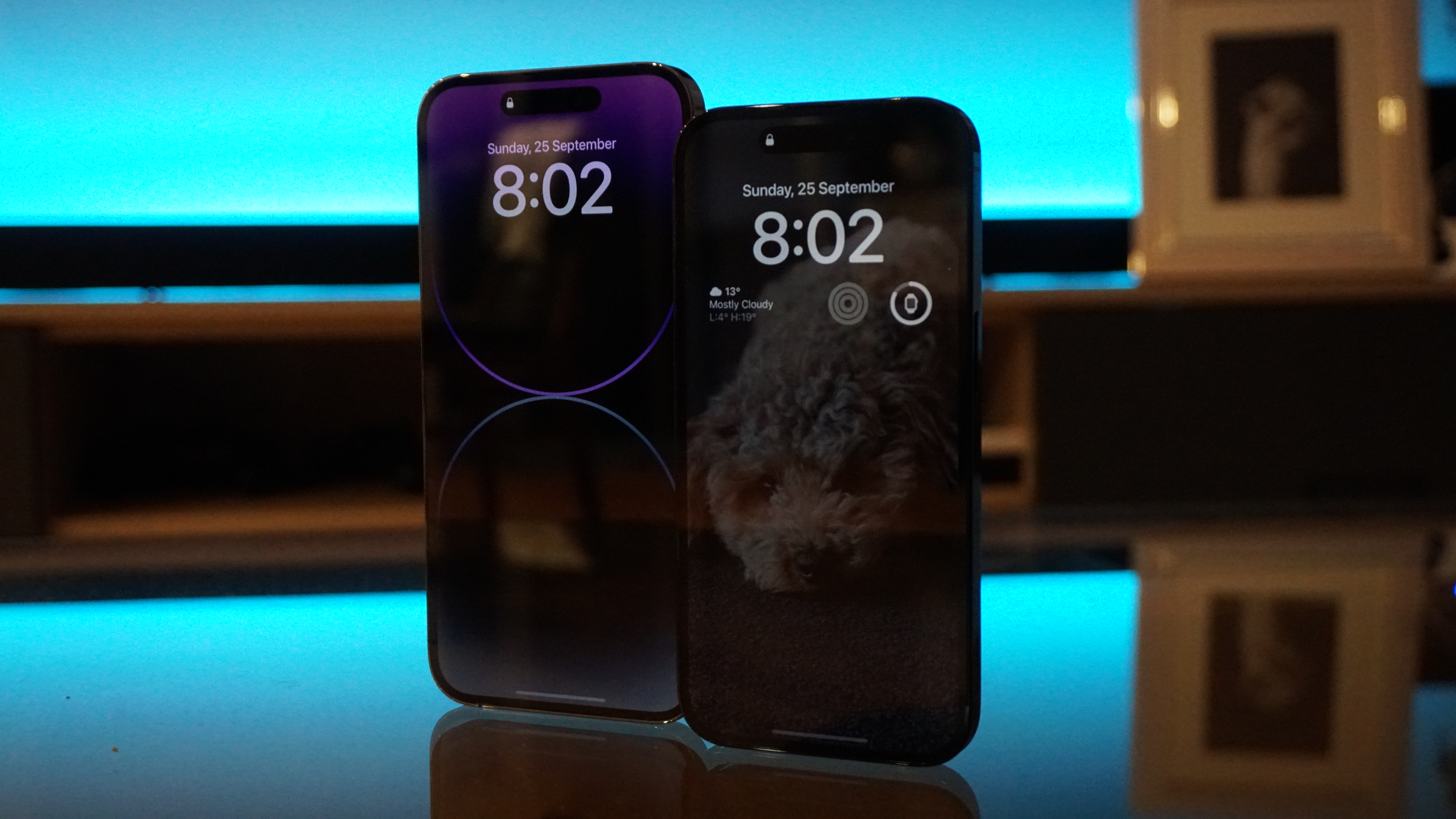
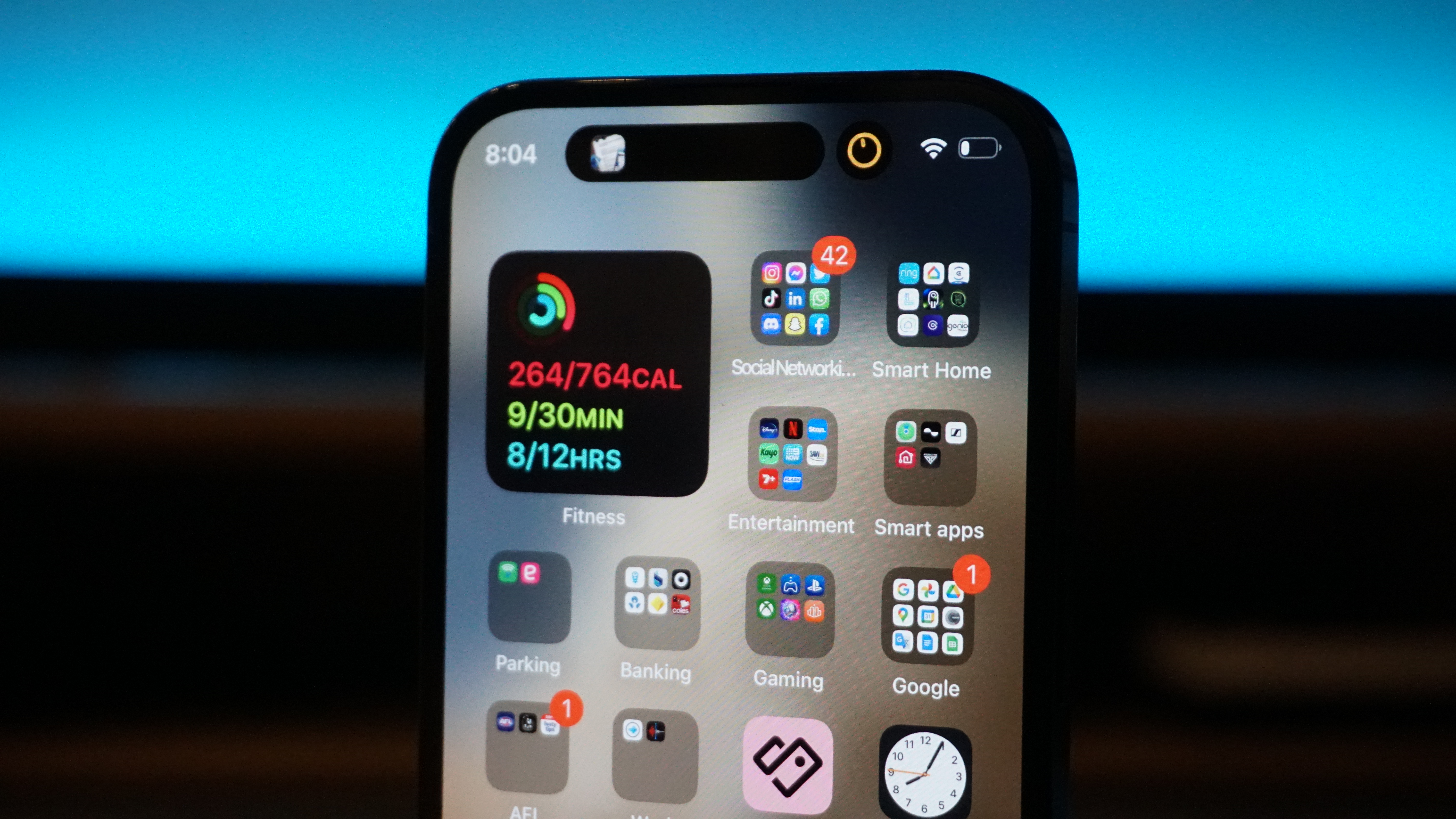
Both the iPhone 14 Pro and iPhone 14 Pro Max feature an always on display.
Always on displays are nothing new.
Apple first used them on its Watch Series 5 in 2019 but has been reluctant to bring the technology to iPhone while Android phones indulged.
The change is jarring at first.
Apple's stand-by lock screen is surprisingly bright and it frequently catches my eye as I assume I've left it unlocked or on.
It continues to display your wallpaper behind a bold digital clock and widgets available courtesy of the iOS 16 upgrade, as-well-as the detail and colour of vibrant notifications; a stark contrast to the dead black screen and muted icons featured in Google's always on solution for Pixel 6.
My instant reaction was to assume this would be a massive drain on the iPhone 14 Pro's battery and – while there is an impact – it is barely noticeable.
READ MORE: Apple's new iPhone has satellite connectivity and an all-new notch
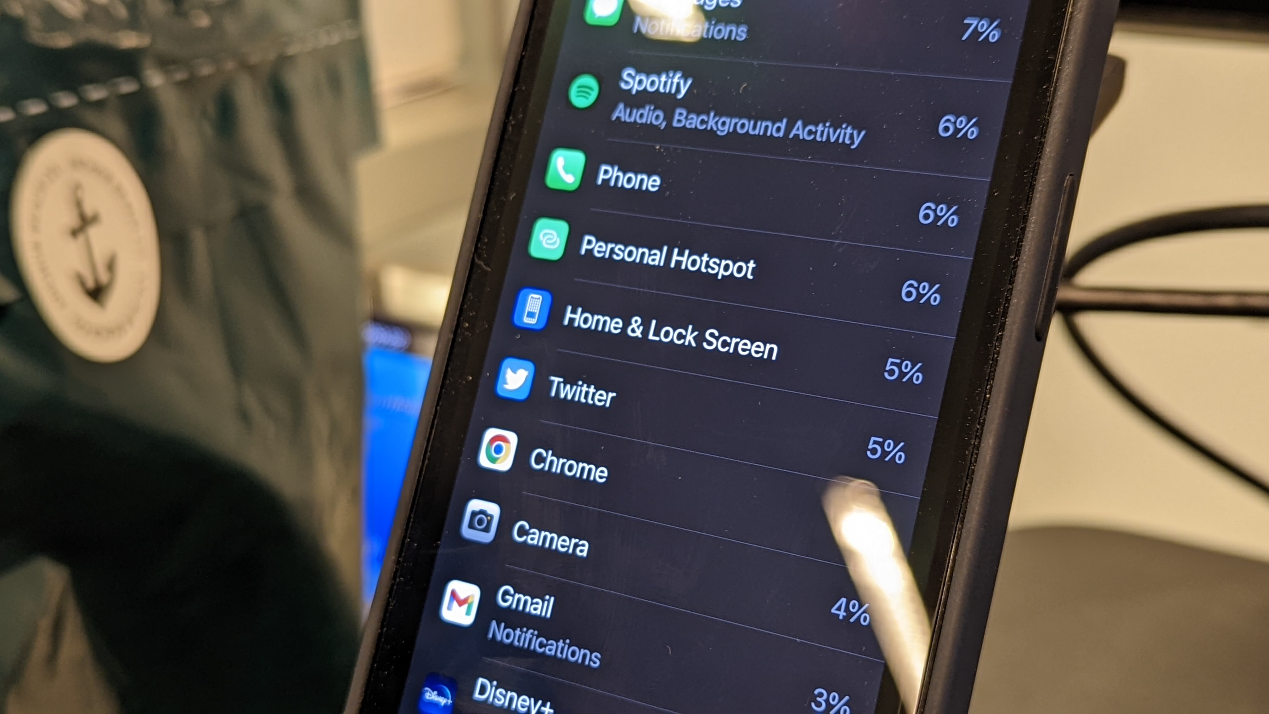
According to the Battery Health settings on my iPhone 14 Pro, my home and lock screen has accounted for 5 per cent of my battery use over the past 10 days.
When I turned off the always on display, my home and lock screen accounted for 3 per cent of my battery usage on any given day – similar to what my wife and I were recording on our iPhone 13 Pro Max and Pro models.
A 2 per cent increase is negligible, but it's still an increase.
For me, that sacrifice is well worth being able to casually check the time, notifications and even continue to navigate on drives (this works with Apple Maps but not Google Maps) while my phone is locked.
Apple talked up the efficiency of its new A16 bionic chip when revealing its iPhone 14 Pro models, but went on to compare its power to the A13.
Upgrading from an iPhone 13 Pro, the change isn't dramatic.
On two days – Monday and Wednesday last week – I did have to reach for the charger during particularly demanding shifts at work with heavy hotspot usage, which managed to drain more than 100 per cent of the iPhone 14 Pro's battery capacity.
I get nowhere close on days off but Apple loyalists who need all day battery life should consider an iPhone 14 Pro Max according to this battery test by Mrwhosetheboss.
Apple knows most people don't upgrade every year and if you're still rocking an iPhone SE, X or older, improvements with MagSafe and brighter, smoother screens will mean as much as the new dynamic island.
READ MORE: Trevor Long's review of the new iPhone 14 Pro
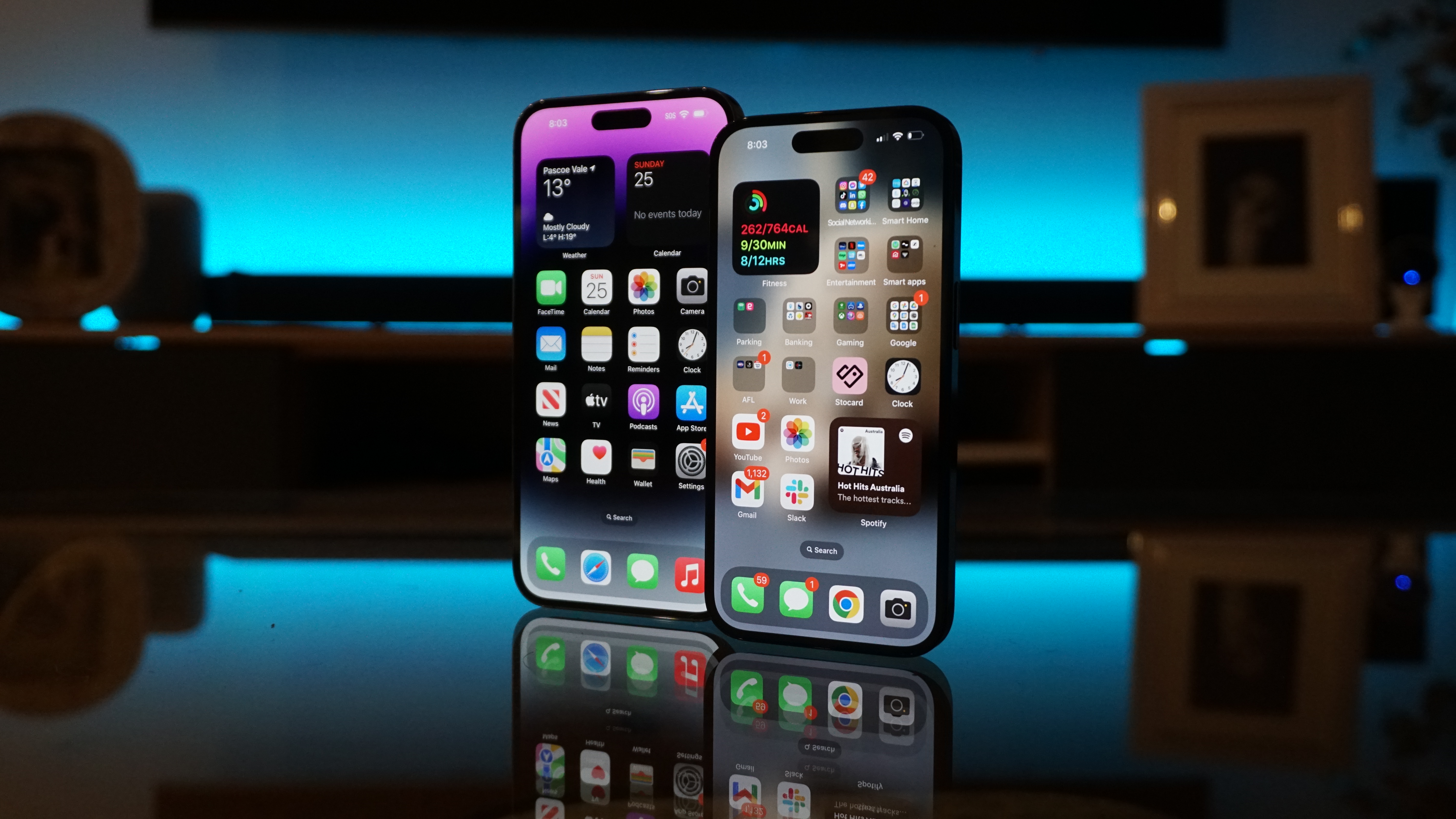
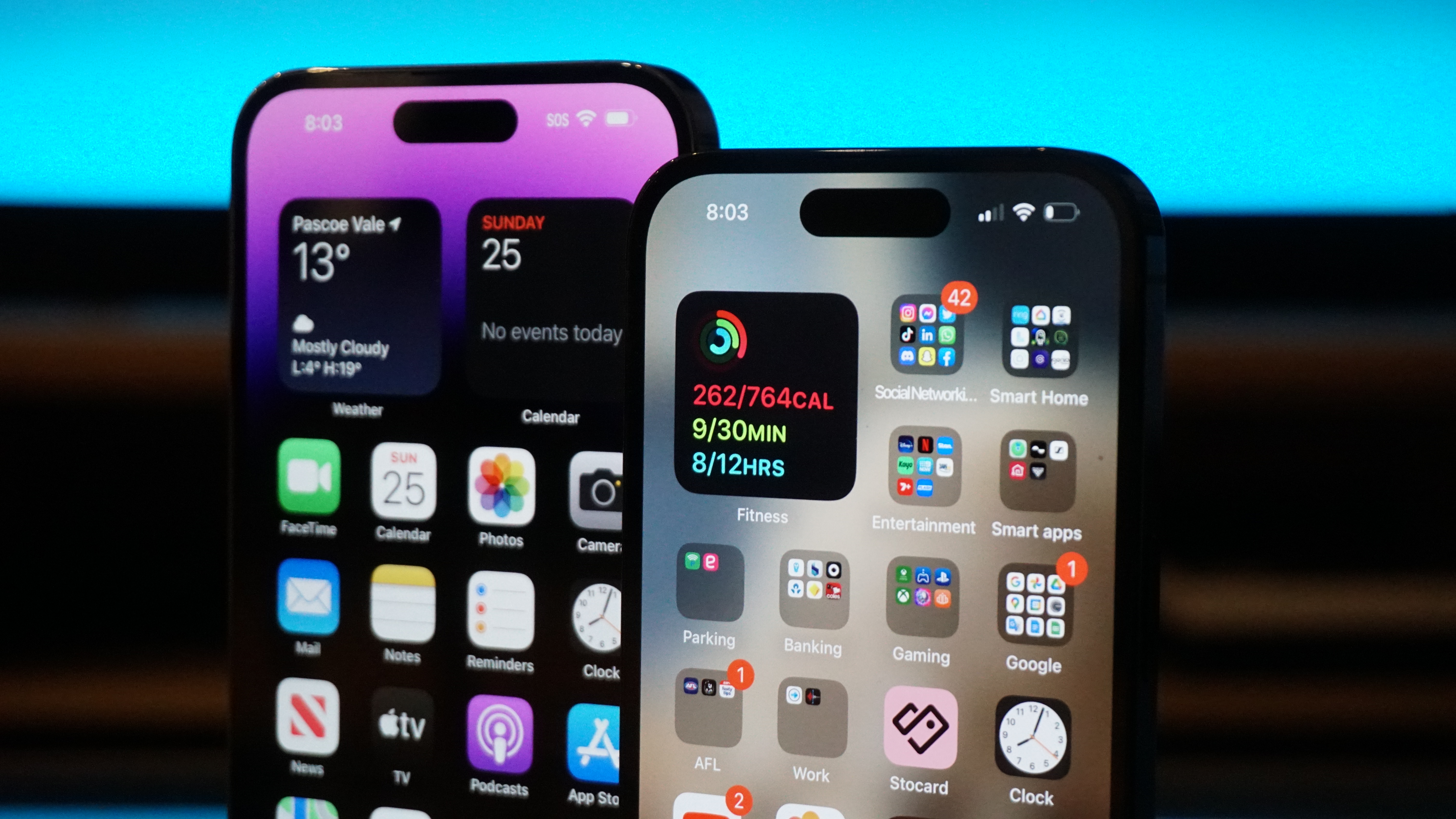
Apple has finally ditched its "eyebrow" notch on its iPhone 14 Pro models.
The new cut out looks like a solid black pill but it's actually disguising two separate pieces of hardware; one for FaceID and one for an improved selfie camera.
The pixels between the two are left black so – from most angles – it all blends together.
On its own, the "pill" is still large and can obstruct videos but it's the software surrounding it that makes it magical.
Apple has cleverly animated the "pill" to grow to different sizes and display certain notifications.
Apple calls it the Dynamic Island.
It is the definition of a nice to have, rather than a must-have, but becomes infinitely more practical once you learn to use it.
Swipe up on your music app, a timer, Apple Maps and more and they'll bounce into a larger dynamic island – keeping critical information at the top of the screen while you do other things.
Two apps can be displayed in the dynamic island at once.
You can access them as you always have (swiping up and holding from the bottom of the screen) or you can simply tap their icon in the dynamic island.
It takes a while to get used to but at its best, works like a taskbar.
This is great for screen recordings and voice memos (which I use for work all of the time), and a few pixels light up in different colours to indicate when your microphone or camera are on as well.
Speaking of cameras, Apple has improved two in particular: the selfie camera can now auto focus at different lengths and the main camera now features a 48mp sensor.
By default, the iPhone 14 Pro models still capture 12mp images but with far greater colour accuracy using a process called "binning" – essentially four pixels on a 48mp shot are condensed into one pixel on a 12mp still.
Its addition also finally allows for a fourth optical zoom; 2x joining 0.5x, 1x and 3x options.
Like the iPhone 13 Pro, the iPhone 14 Pro takes beautiful HDR images.
Apple's ability to fuse multiple images (taken at different exposures) together to maintain detail in dark and bright spots continues to work wonders, like it does on this tricky photo of my pooch Apollo with harsh sunlight streaming through the glass door; the hot concrete isn't blown out and there's still plenty of texture in his shaded fur.
More importantly, it's quick.
There's next to no lag in processing these shots and, thanks to the A16 bionic chip, the same is true for low light photography.
Yes, we're only talking about fractions of a second in some instances, but it makes a noticeable difference when you're taking multiple shots on a night out and (with my shaky hands) struggling to hold the phone still enough (for long enough) to get a clear shot.
If you're big into filming sport or chasing your kids around the house, there's a new action mode that keeps videos remarkably stable, even at a sprint.
Apple has also added the ability to film at 24 and 25 frames per second (the Australian, PAL standard) to Cinematic mode if you're after a film-like look.
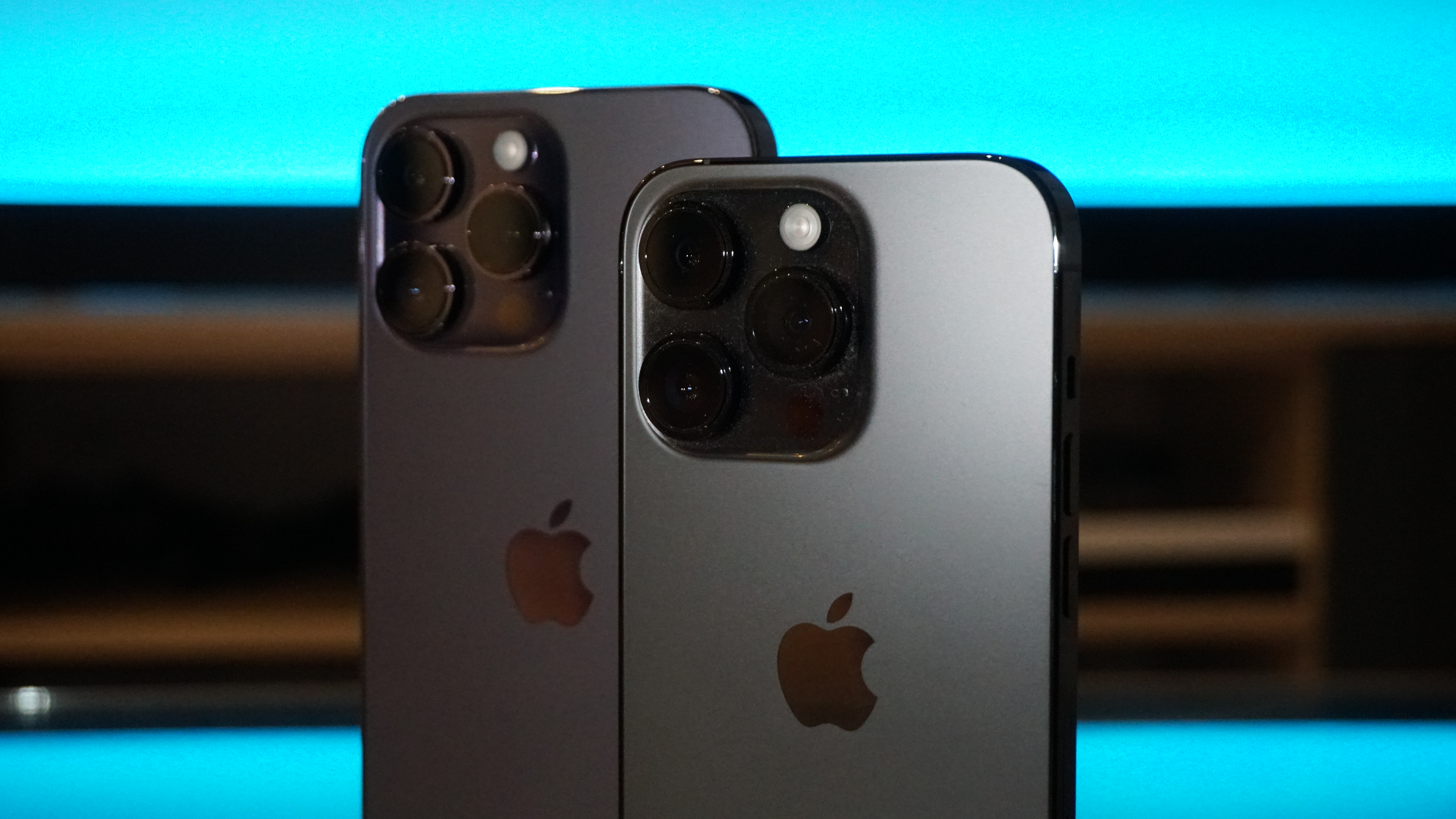
That extra power is packed in a noticeably thicker camera bump on the back of the iPhone 14 Pro models but both still fit just fine into cases designed for their iPhone 13 counterparts.
While the shape of the phones may not have changed, Apple has changed the way they're built.
The back glass is no longer stuck to the phone's internals, which should make replacing a smashed back panel much easier and (thankfully) much cheaper.
Apple has also packed in new accelerometers and G-force sensors which – when combined with the sound of screeching metal – can detect whether or not you've been in a car crash.
The new Apple Watch Series 8 can do this too.
If you have both, a notification will pop up on your wrist (assuming it's closer to you after a smash) and if it doesn't get a response, it will automatically call emergency services and repeatedly play a recording of your location.
It's a very cool feature that I (hopefully) won't be trying any time soon.
Later this year, Apple will also update its line of iPhone 14 phones to be able to communicate with satellites in emergencies when out of typical phone range.
This is only planned for the US and Canada at this time, so shouldn't be a major factor in your purchasing decisions.
iPhone 14 Pro starts at $1749 AUD.
iPhone 14 Pro Max starts at $1899 AUD.
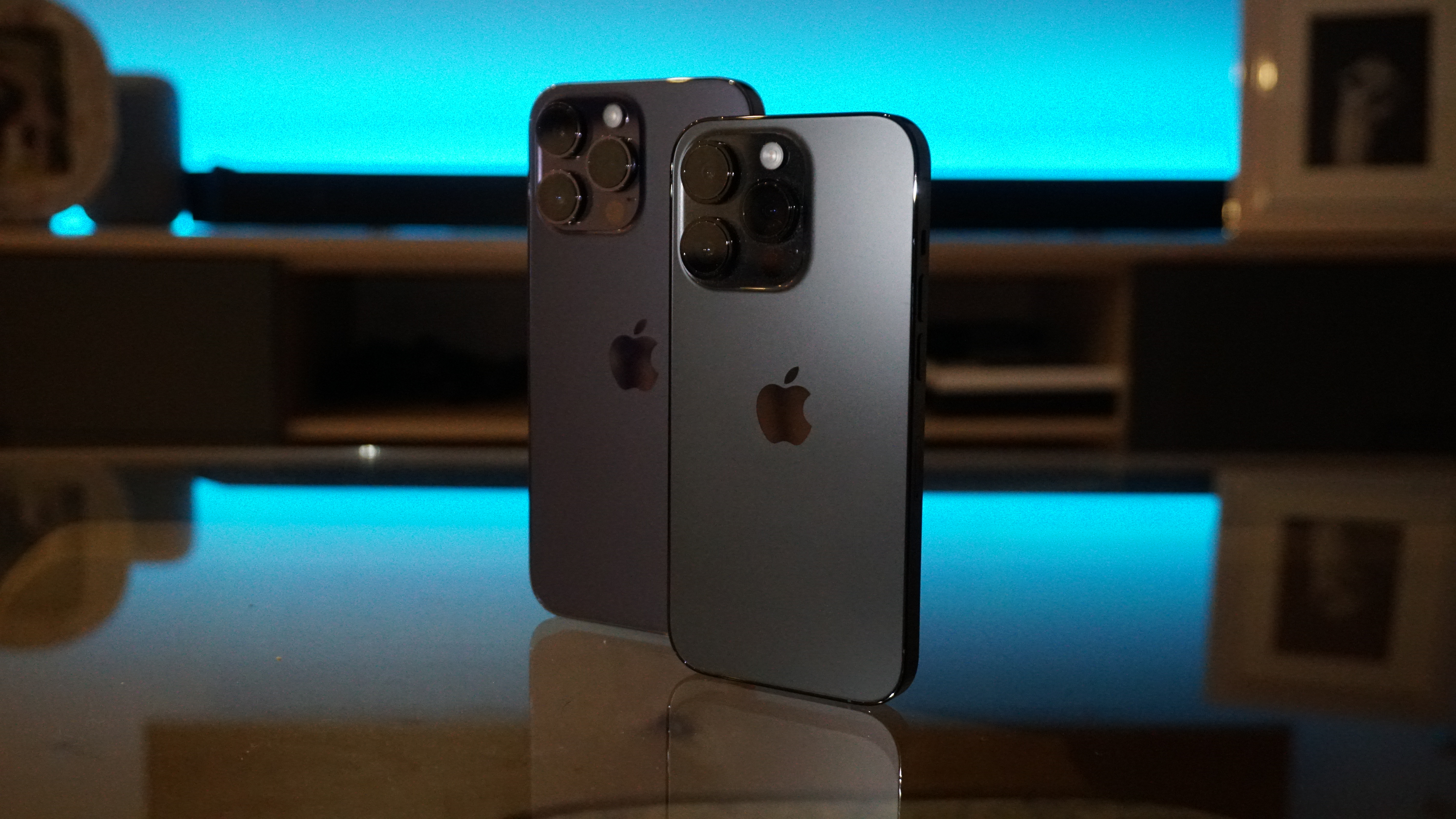
Both are available now in four colours: Space Black, Silver, Gold and Deep Purple.
Each is gorgeous to the touch with a solid matte finish but you'll likely whack a case over that and spend your time looking at the screen anyway.
At peak brightness, iPhone 14 Pro can hit 1200 nits playing HDR content, which is 33 per cent brighter than last year's model and a great boost if you're outside a lot, competing with the glare of the sun.
Is it a massive leap forward? No.
Is it better than last year's models? Absolutely.
Is it worth an upgrade?
That depends on the phone you currently have – and how much you're willing to spend – but these are Apple's best for a reason.
Apple provided 9news.com.au with an iPhone 14 Pro and an iPhone 14 Pro Max for the purpose of this review.
Source: 9News

