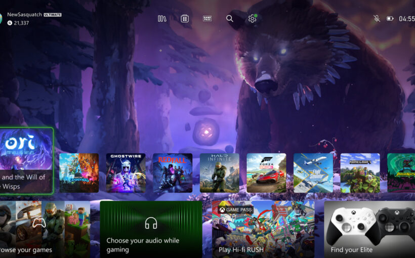
Microsoft has reworked its Xbox Home UI to better accommodate background images and simplify access to key parts of the Xbox dashboard. The software giant halted a test of an upcoming Xbox Home UI last month to rework it, and the result looks like a great improvement for Xbox owners.
The new Xbox Home UI moves the tiles of apps and games down further, so there’s a lot more space to see a background. The tile sizes have also been reduced, and there’s a new responsive game art that will update the background when you hover over certain games and apps.
At the top, there’s a new floating UI that provides quick access to the game and app library, Microsoft Store, Xbox Game Pass, search, and settings. This quick access menu means you don’t even need to navigate into the usual parts of the Xbox dashboard to quickly get to your entire game library.
Microsoft is testing this new Xbox Home UI with Alpha Skip-Ahead and Alpha Xbox Insider testing rings this week, and it will likely roll this out to Xbox consoles in the coming months. “We designed hundreds of options, then refined with prototypes and finally user-tested in our Research labs until we found one we hope you’ll love,” says Ivy Krislov, senior product manager lead for Xbox experiences. “It balances the experience, accessibility, function, and the needs of our community.”


