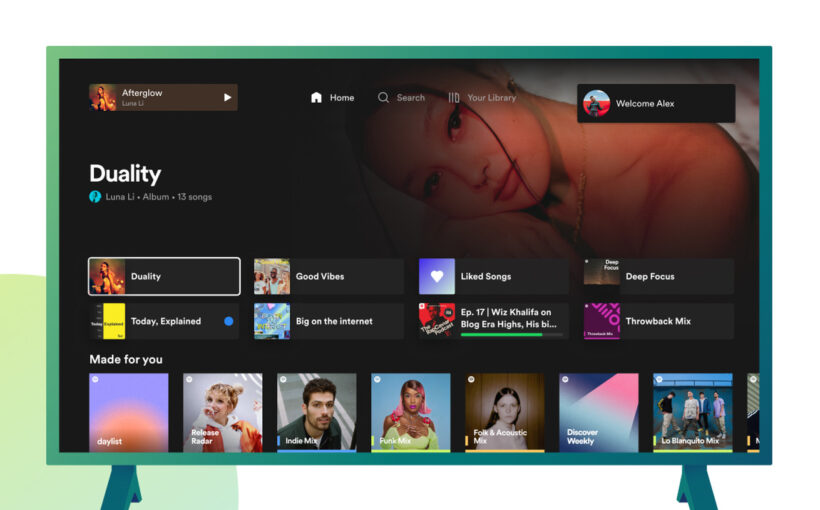
Spotify is rolling out a redesigned TV app that should make it a little easier to find what you want to listen to. The app comes with a new homepage that’s similar to Spotify on mobile and desktop, featuring your most-listened-to content at the top, followed by your Made For You playlists and your recently played albums or podcasts.
There’s also a new playback queue that you can open up from the right side of the screen, allowing you to see the audio that’s currently playing as well as what’s coming up next. Spotify added a new dark mode option as well, along with a way to switch between accounts by selecting your profile in the top-right corner of the screen.
:format(webp)/cdn.vox-cdn.com/uploads/chorus_asset/file/25070679/spotify_playback_queue.png)
Spotify’s previous TV app was a little harder to navigate, leading some users to open Spotify on their phones and control what’s playing from there. The new app is at least a little more in line with what you’d see on your phone or desktop. Spotify says the updated app is coming to both free and Premium users on compatible smart TVs, gaming consoles, and media streaming devices.


