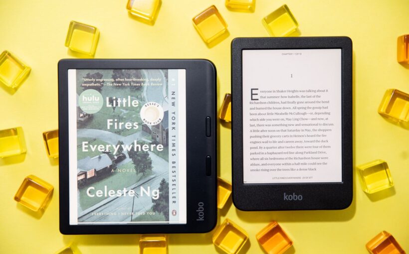
They’re more colorful than anything Amazon offers and have built-in support for Overdrive, but the UI feels more focused on selling books than reading them.
The problem with most e-readers is they’re not really intended for reading books. They’re meant to sell you books. Amazon, which has the biggest market share in the US, is especially notable for doing this, but Barnes & Noble is guilty of the same thing. Kobo is perhaps the least offensive about this — it’s got Pocket and Overdrive integration! But oftentimes, when I found myself totally enamored with Kobo’s gorgeous new color e-readers, I’d suddenly get slapped with the reminder: this thing is here to sell me books.
Which is a shame because Kobo’s new Libra Colour and Clara Colour are the closest we’ve gotten to a perfect e-reader lately. Both the $219.99 Libra Colour and $149.99 Clara Colour are ridiculously light, but with a sturdiness that makes them feel comfortable and not flimsy. Both include Kaleido 3 displays, which means book covers are rendered in actual color. Both flip pages and navigate stores much quicker than the $249.99 Boox Page (the bigger, slower sibling of the Palma) — impressive, given the fact that the Kaleido 3 display is a little slower than a more traditional monochromatic E Ink display found in the Page.
:format(webp)/cdn.vox-cdn.com/uploads/chorus_asset/file/25435398/247104_Kobo_color_e_readers_AKrales_0046.jpg)
I did find myself liking the more expensive Libra because I prefer asymmetrical e-readers with dedicated buttons to ones that function more like traditional tablets. That it also has stylus support for note-taking is a plus. Yet, either one is a charming and enjoyable-to-use e-reader, and over the last couple of months, I repeatedly found myself reaching for the Libra over the Boox — which, until now, has been my primary e-reader. I just like the feel of reading on it more. Sure, Boox gives me every reading app available (it’s an E Ink Android tablet), but the Libra doesn’t have any of the weird little hiccups typical of Android on E Ink.


:format(webp)/cdn.vox-cdn.com/uploads/chorus_asset/file/25435397/247104_Kobo_color_e_readers_AKrales_0039.jpg)
