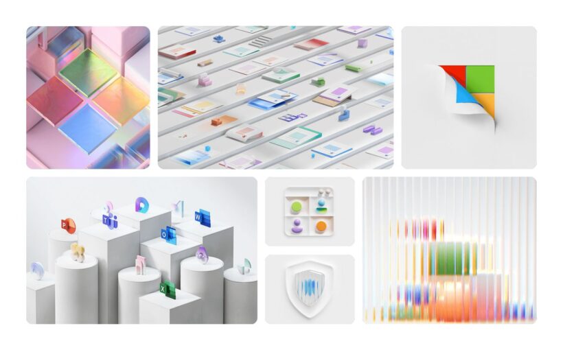
Microsoft is overhauling the illustrations it uses throughout its products and services to make them less flat and more playful and interesting. The previous iteration of illustrations was heavily vector-based, with a flat illustration style that can be found throughout apps like Microsoft Teams, Skype, Office, and even parts of Windows. Now, Microsoft is shifting towards 3D designs that bring back skeuomorphism, together with more colorful and playful designs.
“Our studies showed that while our illustrations could be described as colorful, inclusive, and genial on a surface level, they were received within consumer culture as uninteresting and emotionless,” explains the Microsoft Design team in a blog post outlining the new illustrations. “The flat vectorized style that was once hugely popular across the industry was now communicating sub-optimally and potentially evoking ideas and themes that were misaligned with our company values.”
:format(webp)/cdn.vox-cdn.com/uploads/chorus_asset/file/25631141/oldfluent.png)
Microsoft has now overhauled its illustrations with a style that is “designed to simplify and unify our products with a distinct Microsoft aesthetic.” The result is the integration of a lot more shapes and symbols from Microsoft’s Fluent design language, with a more saturated color palette.
The 3D illustrations are a lot more expressive and playful than the flat and desaturated style that Microsoft has been using in recent years, with a focus on soft contours and more curves, shapes, and elements that mirror the natural world.
:format(webp)/cdn.vox-cdn.com/uploads/chorus_asset/file/25631142/fluentillustrations2.png)
Microsoft’s new illustrations should also better complement accompanying text. “Our previous illustrations often duplicated accompanying written copy, creating unnecessary mental strain and occasional confusion,” says Microsoft’s design team. “Being more intentional with how our illustrations harmonized with other elements within the user’s experience could help alleviate this.”
Microsoft is now using more general-purpose illustrations across different apps, so there are fewer bespoke illustrations that used to make its products look and feel different. “We also leveraged our Fluent iconography to repeat, reuse, and re-purpose a series of connected objects,” says Microsoft.
The challenge for Microsoft now will be updating its illustrations across all of its products and services in the months ahead. Microsoft continues to evolve its iconography, illustrations, and overall Fluent design system regularly, so expect to see even these latest illustrations refined again in the future.


