On Thursday, Pantone announced its much-awaited “Colour of the Year 2025.” (Well, “much-awaited” if you’re into this sort of thing.)
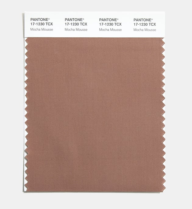
The big winner? Mocha Mousse (17-1230), a shade that the Pantone Color Institute calls “an evocative soft brown that transports our senses into the pleasure and deliciousness it inspires” while “appealing to our desire for comfort.”
Here it is:
 The Pantone Color Institute calls the shade “an evocative soft brown that transports our senses into the pleasure and deliciousness it inspires.”
The Washington Post heralded the shade as a “win for quiet luxury.” Vanessa Friedman of The New York Times said her “mind went immediately to comfort eating.”
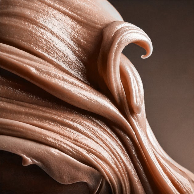
On social media, the feedback was a little more mixed. Because of the visuals released by Pantone, some pointed out that the color bore a certain likeness, to, well ― there’s really no delicate way to put this ― poop.
 Some on social media remarked that the color looked a little like, well, poop.
Some sample scatological quips from Threads and X?
it tracks that the #pantone color of the year is poop pic.twitter.com/aag0RWDOIF
— america hates women (@kimvondoom) December 5, 2024
Others compared it to Nazi uniform brown or “the shade of lightly soiled mop water.” Several said it felt like just the right shade to welcome in 2025.
“Instantly depressed seeing Pantone’s Color of the year for 2025, which I guess is on par with the theme of 2025. Touché, Pantone, touché,” one person wrote on Threads.
Colour consultant Laury Rosenthal gave props to Pantone for choosing a shade of brown for the first time in its 25 years of selecting a colour of the year. Still, she wishes the colour was a tinge darker.
“It’s great to eat chocolate mousse but the colour looks a bit like a poo emoji,” she wrote to HuffPost. “It will look worse when in paint as Pantone ink is clear and base paint starts out blue white before pigment gets added. I’d rather have a darker taupe, if asked.”
But elsewhere online, women of colour celebrated the pick, noting that others’ dismissiveness of the shade was a little white-centric.
Charnaie Gordon, a teacher and children’s book author, is among the fans of the pigment. As a Black woman, she sees the color as “rich, grounding, and unapologetically bold.”
“Pantone finally caught up to what we’ve been knowing all along: melanin magic is unmatched,” Gordon told HuffPost. (She shared a similar sentiment on Threads.)
“To me, this color represents a statement about resilience, beauty, and depth,” she said. “I couldn’t be more excited that this is the energy we’re stepping into for 2025, it feels like an unspoken ode to Black and brown people everywhere.”
“It’s richness, warmth, and melanin on full display,” she said. “If you can’t see the beauty in that, the problem isn’t the colour, it’s your perception.”
Amy Ellzey, a colour consultant and owner of Colour Me Beautiful LA, thinks folks should get their mind out of the gutter with the colour.
“Although some may draw comparisons of this colour to unappealing aspects of nature, you could also positively consider [it] a desirable milk chocolate or opaque latte,” she said.
Given the emphasis on millennial gray and other flat neutrals (namely, white and black), Lauren F. Battistini of LFB Color Consulting is thrilled with Pantone’s choice.
“It’s a clear indicator that the fashion, home, interiors and other industries are shifting to something with more comfort, warmth and earthy appeal,” she said. “The colour pendulum shifts about every 3-4 years, and we have been witnessing a shift for some time over to a warmer, earthy colour palette.”
Plus, Battistini said, this particular shade of mocha plays nicely with other colours.
“A neutral such as Mocha Mousse doesn’t necessarily hold much presence on its own, but when you pair it with the right colours, it serves as a visual comfort within the overall colour palette,” she said.
“I see it as a perfect anchoring neutral to combine with colours such as cream, aqua, ochre, warm red, aubergine, blush, cinnamon and warm greens,” she added.
One thing everyone can agree with? If Mocha Mousse gives us a break from Brat green, we’re all winners.


