What is the Bitcoin Rainbow Chart?
The Bitcoin Rainbow Chart is a long-term valuation model that uses rainbow-colored, logarithmic bands to visualize Bitcoin’s price and indicate potential trading opportunities.
- Origin: The Bitcoin Rainbow Chart is a Bitcoin price valuation tool made in 2014 by Bitcointalk user “trolololo” and Reddit user “azop”.
- How to read it: The rainbow colored bands help to identify the market cycles of Bitcoin, with Red being overbought periods and Blue being oversold periods.
- Best used: The chart is best used in conjunction with other Bitcoin financial models such as the Stock-to-Flow model and other traditional methods of valuations.
- Key limitation: The main criticism of the model is its retrospective bias. it relies heavily on past performance and cannot predict unprecedented market events like black swan crashes.
- Recent history: The chart has been updated multiple times, most recently in 2023, though even the recalibrated model’s floor was breached in 2026 for only the second time in Bitcoin’s history.

Understanding the Bitcoin Rainbow Chart

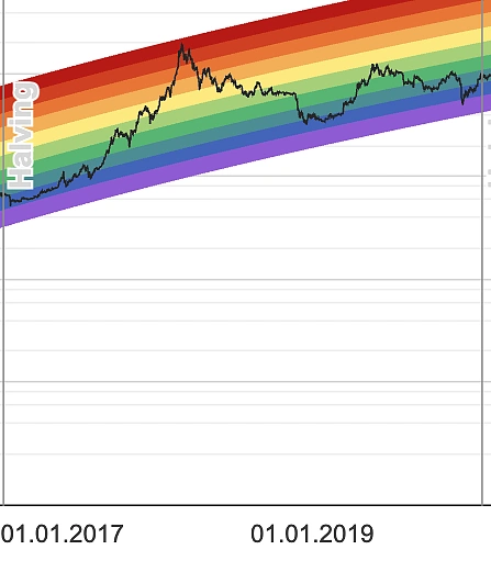
The Bitcoin Rainbow Chart is a best-fitted logarithmic chart that accounts for the highs and lows of Bitcoin’s historical price values. There is no industry wide accepted formula for the graph, but the general consensus is that it aims to identify the price zones that have historically represented market cycle highs and lows. By extrapolating this historical channel into the future, the model offers a perspective on where these zones might lie if Bitcoin maintains its past, uptrend trajectory.
Why Use a Logarithmic Chart?
The Bitcoin Rainbow Chart’s iconic shape (curved) is a special type of scale used to represent data called “logarithmic” (or “log” for short). The chart shows percentage changes rather than absolute dollar amounts, thus allowing better visualization of growth.
For instance, when Bitcoin first went from $1 to $10, that’s a 10x increase, when it went from $10,000 to $100,000, that’s also a 10x increase. However, on a linearly scaled chart, the second price jump looks massive while the first jump will not be visible. A log chart fixes this by showing both 10x moves as the same size visually.
Notice how Bitcoin’s price appears almost flat from 2013 to 2017 on a linear chart? That’s misleading.

How to Read the Rainbow Chart: What the Colors Mean
Traders can use the Bitcoin Rainbow Chart by using the colored bands to support their trading decisions, potentially identifying entry and exit points for Bitcoin.
|
Color Band |
Signal |
What It Means |
Typical Action |
Risk Level |
|---|---|---|---|---|
|
🟦 Dark Blue |
Fire Sale |
Bitcoin is extremely undervalued |
Strong Buy – Excellent long-term entry |
Low |
|
🔵 Blue |
Buy! |
Significantly undervalued |
Buy – Good accumulation opportunity |
Low |
|
🟢 Green |
Accumulate |
Undervalued but recovering |
Buy/Hold – Continue building position |
Medium |
|
🟡 Light Green |
Still Cheap |
Slightly undervalued |
Hold – Fair value territory |
Medium |
|
🟡 Yellow |
HODL! |
Fairly valued |
Hold – Neutral zone, stay patient |
Medium |
|
🟠 Light Orange |
Bubble? |
Potentially overvalued |
Caution – Consider taking some profits |
High |
|
🟠 Orange |
FOMO Zone |
Likely overvalued |
Reduce – Good time for partial selling |
High |
|
🔴 Red |
Sell Territory |
Significantly overvalued |
Sell – Strong profit-taking signal |
Very High |
|
🔴 Dark Red |
Maximum Bubble |
Extremely overvalued |
Strong Sell – Historical crash warning |
Very High |
The exact number of color bands vary depending on which Bitcoin Rainbow Chart model you use, but generally the graph follows the color scheme of a rainbow, with blue colors representing periods of accumulation and red colors representing periods to take profits.
Disclaimer: The Bitcoin Rainbow Chart is a long-term visualization of price action using historical price values. Past performance is not indicative of future results, this chart is best used to gauge market sentiment in conjunction with other traditional, evidence-based valuation methods you may have. You should not blindly buy or sell Bitcoin solely on the basis of the Bitcoin Rainbow Chart.
Understanding the Psychology Behind Each Zone
Dark Blue: Basically a Fire Sale
When the price of BTC is in the dark blue zone, the market is in a significant correction or bear market trough. A colloquial indicator for when Bitcoin is in this zone is when public media declares “Bitcoin is dead!” — hence the label on the original model.
Historically, dark blue has been rare. Bitcoin spent time in this zone during the 2022 bear market, bottoming near $15,500, before eventually recovering. As of 2026, Bitcoin has entered the zone again following a roughly 50% drawdown from all-time highs. In the 2022 instance, the zone preceded a recovery, though the timing and magnitude of any similar move from the current level remains to be seen.
It’s worth noting that the dark blue zone is a sentiment reading, not a guarantee of a bottom. Analysts are divided on whether a breach of this band signals extreme undervaluation and a long-term buying opportunity, or whether it reflects a structural shift in Bitcoin’s market dynamics that the model wasn’t designed to capture. As always, use this signal alongside other indicators rather than in isolation.
Blue-Green: Buy!
The blue-green zone on the Bitcoin Rainbow Chart represents a slight recovery from a dip or correction. The market is showing signs of strength, and it may present an opportunity for investors to buy as the price rises.
Green: Accumulate
The green zone suggests that BTC is oversold and bullish investors can consider accumulating more coins. It signifies that BTC is in a stable phase and may be poised for more growth.
Light Green: Still Cheap
The light green zone suggests that BTC is still undervalued relative to its historical price trend but only slightly so.
Yellow: HODL!
The yellow zone on the Bitcoin Rainbow Chart represents a market phase where the focus changes from accumulating to holding onto BTC as an investment. The color suggests that the asset is expected to remain stable.
Light Orange : Is This a Bubble?
The light orange zone indicates that the market may enter a speculative phase. It signals that Bitcoin’s price is increasing at an accelerated rate, where critics are labeling it a bubble. Investors should be cautious in this phase and may consider taking profits, especially in the case of active traders.
Orange : FOMO Intensifies
The orange zone on the Bitcoin Rainbow Chart represents a phase of the market where investors should be cautious. It signifies that bitcoin’s price is rising at an unsustainable rate, and investors may be tempted to buy due to FOMO (fear of missing out) as the price rises. This phase is usually accompanied with a significant increase in new investors, especially investors who might not be well aware of what Bitcoin and cryptocurrencies are.
Red: Sell!
The red zone on the Bitcoin Rainbow Chart represents a market phase where investors may consider selling their bitcoin investments if they’re not looking to HODL long term. The band signals that Bitcoin’s price has reached an unsustainable level, and a market correction is expected. There is an opportunity here for investors to consider taking profits in this phase, especially if they have a significant amount of bitcoin.
Dark Red: Maximum Bubble Territory
The dark red zone indicates that the market is in a bubble and the price of bitcoin is significantly overvalued. The band suggests that investors should be extremely cautious and may consider selling their Bitcoin investments if they have invested for short-term gains. The market may experience a significant correction or crash, and investors who hold bitcoin in this phase may experience considerable losses.
The Origins of the Bitcoin Rainbow Chart
The chart first came to life in 2014 when Reddit user azop shared an image of Bitcoin’s price chart with a straight, rainbow layered over it. It was nothing more than a joke at that moment with azop sharing that he first visualized it as a rainbow to show that “it was not professional advice”.
The first Bitcoin Rainbow Chart.

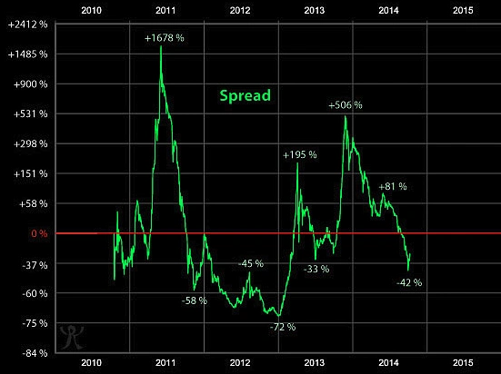
The graph was generally not taken seriously, with users calling it an “advertisement to buy Bitcoin”. That was until Bitcointalk forum user “Trolololo” merged and made use of the rainbow color scheme in his logarithmic regression model, that aims to map out Bitcoin market cycles.
Trolololo’s initial log model.
The combination of their efforts resulted in the Bitcoin Rainbow Chart which was widely used, both seriously and unseriously by the Bitcoin community for years to come.
A Practical Guide: Using the Rainbow Chart with Other Bitcoin Models
The rainbow chart becomes most effective when combined with complementary Bitcoin valuation models, such as the Stock-to-Flow (S2F) model.
The Stock-to-Flow Model
Created by PlanB in 2019, the S2F model is another popular Bitcoin price prediction model that uses scarcity mechanics to predict the future price of Bitcoin. The S2F measures the ratio of existing Bitcoin supply (stock) to new Bitcoin production (flow), similar to how precious metals like gold are valued.
The two models create an interesting dynamic. The S2F model is supply-based, whereas the Rainbow Chart is market sentiment-based, making it more demand-focused. Both models complement each other well because they capture different aspects of Bitcoin’s valuation.2F excels at identifying multi-year trends driven by supply shocks (halvings), while Rainbow Chart better captures market psychology and cyclical behavior.
Smart analysts often use both, S2F is used for understanding fundamental scarcity value and Rainbow Chart for timing market cycles. Neither should be used in isolation, but together they provide a more complete picture of Bitcoin’s complex valuation dynamics.
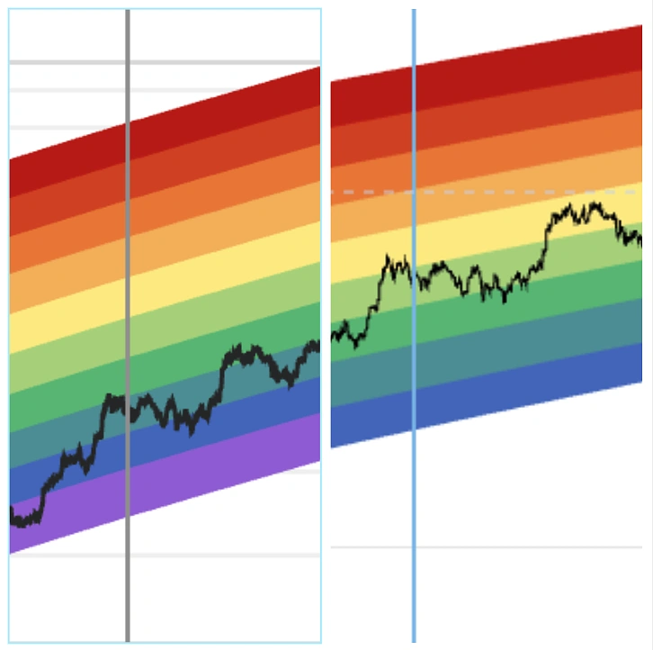
A practical application involves cross-referencing both models for validation. For instance, the rainbow chart was in the red zone in early 2018, while the S2F model indicated Bitcoin was significantly overvalued relative to its scarcity-based fair value. Both models signaled overvaluation, providing higher confidence in a bearish outlook.
Conversely, when the models disagree as they did in parts of 2019, it suggests that investors should exercise greater caution and potentially wait for clearer signals before making significant position changes.
The rainbow chart for years 2017 to 2020, 2018 shows undervaluation.

Other Indicators
Besides the S2F model, you can also make use of other indicators to employ a similar strategy, to strengthen your analysis and boost confidence in your trading decisions.
Crypto Fear and Greed Index
This index measures the market sentiment in the crypto markets, based on the two emotions, fear and greed. The index considers market volatility, volume, dominance and social media to determine a numeric figure between 0 to 100, with 0 being extreme fear, and 100 for extreme greed.
Bitcoin Halving Cycles
Bitcoin halvings refers to the built-in feature of the Bitcoin blockchain, that cuts mining rewards in half approximately every four years. Each halving event is considered a significant market milestone with heavy implications on Bitcoin’s supply dynamics. Traders should make a note of when each halving is expected to take place, as there is usually an increase in market volatility during those periods.
The Limitations of the Bitcoin Rainbow Chart
While the Bitcoin Rainbow Chart provides an easy visualization of when BTC appears to be under or overvalued, here are some limitations to keep in mind:
Retrospective Bias
The Rainbow Chart’s biggest weakness is its retrospective nature:
-
Fits historical data perfectly but can’t predict unprecedented events such as major exchange hacks, coordinated whale liquidations.
-
It relies on historical volatility, causing the chart’s accuracy to decline as asset volatility changes (more on this later).
Unsuitability for Short-term Trading
The logarithmic chart explicitly smooths out daily volatility:
-
Designed for multi-year holding periods
-
Provides no guidance for daily or weekly moves
-
Can remain in one band for months during consolidation.
Lack of Fundamental Analysis
The Rainbow Chart is purely technical, ignoring:
-
Macroeconomic factors (inflation, interest rates)
-
Regulatory developments
-
Technological upgrades (Lightning Network, Taproot)
Black Swan Vulnerability
Historical examples of chart failures:
- 2020 COVID crash: Price briefly pierced below the rainbow before recovering sharply within weeks
- 2022 FTX collapse: Extended period below the “Fire Sale” band, with BTC bottoming near $15,500
- 2026 bear market: Bitcoin broke below the floor of the updated 2023 model and has continued falling through the original “Bitcoin Is Dead” zone, trading at approximately $59,679 — around 9.8% below even the lowest band of the original Rainbow Chart as of June 2026. The model now shows no floor, meaning it offers no lower reference point if prices fall further.
- Cannot anticipate sudden market shocks or macro-driven regime changes
- Assumes continued adoption and exponential growth that may no longer reflect Bitcoin’s maturing market structure
Lack of Model Consensus
As there is no universally accepted standard for modelling the Bitcoin Rainbow Chart, which color zone Bitcoin occupies varies from platform to platform. This lack of consensus diminishes the reliability and usability of the model.
The June 2026 situation illustrates this well. Blockchain Center’s original model places Bitcoin in the “Bitcoin is dead” zone, with BTC trading approximately 10% below the floor of that model’s lowest band as of June 2026.

BitBo’s version, which includes an additional “Low” band below the standard rainbow, similarly places Bitcoin outside its main colored range. Notably, BitBo flags the current zone as having “No Floor,” meaning the model offers no lower reference point if prices continue to fall.

The two platforms agree that Bitcoin is in an extreme zone, but their band structures, thresholds, and labels differ enough that a reader checking one without the other would get an incomplete picture. This is precisely why the Rainbow Chart should always be used alongside other indicators rather than in isolation.
The Future of the Rainbow Chart
As Bitcoin matures, the Rainbow Chart faces the challenge of adapting to a changing market. In 2023, Blockchain Center updated their model with a flattened curve to reflect Bitcoin’s slowing growth rate as it approaches mainstream adoption. The bands were narrowed to account for decreasing volatility and recalibrated using additional price data from recent cycles.
This update highlights a critical question, can any historical model remain accurate as Bitcoin transitions from a speculative asset to institutional infrastructure? The original Rainbow Chart assumed continued exponential growth, but as Bitcoin’s market cap approaches that of major asset classes, percentage gains naturally diminish. Without periodic recalibration, Bitcoin risks remaining in lower bands indefinitely, potentially invalidating the model’s usefulness.
2025 Bitcoin prices in the old rainbow chart versus the 2023 updated rainbow chart on Blockchain Center.
Conclusion
The Bitcoin Rainbow Chart has evolved from a forum meme into one of the most recognisable long-term visualisation tools in crypto — and in mid-2026, it finds itself at a genuinely interesting crossroads.
For only the second time in its history, Bitcoin has broken below the chart’s lowest band, falling through the original model’s “Bitcoin Is Dead” zone to around $59,679 as of June 2026 — roughly 50% below the October 2025 all-time high of $126,000. The breach has reignited a debate that has been building for years: is this a historic buying signal, or has the market simply outgrown the model?
The honest answer is probably both. The Rainbow Chart’s value has always been as a sentiment gauge — a way to visualise where the crowd’s psychology sits relative to Bitcoin’s long-run trajectory. In that sense, the current reading is meaningful: it reflects a period of extreme pessimism. But as institutional capital, ETF flows, and macro forces play a larger role in price discovery, the precise band boundaries carry less weight than they once did.
Whether Bitcoin recovers back into the chart’s historical range or continues to trade outside it may ultimately say more about the model than the market. Either way, the Rainbow Chart remains a useful starting point for long-term perspective — just not a tool to rely on in isolation.
As always, this article is not intended as financial advice and is only provided for information purposes.